Teddy-Beau: an ignorant dithering algorithm.
For nearly a year now, I’ve spent every single day digging deeper and deeper into the strange world of dithering. This is that story, as well as a little bit about how I came to write my very own dithering algorithm founded on pure, unadulterated ignorance.
Intro
This blog is half recipe, half scientific paper. If you want an over the top introduction on me, what I do, and how I got to this point, feel free to read on. Otherwise, skip ahead, I won’t notice.
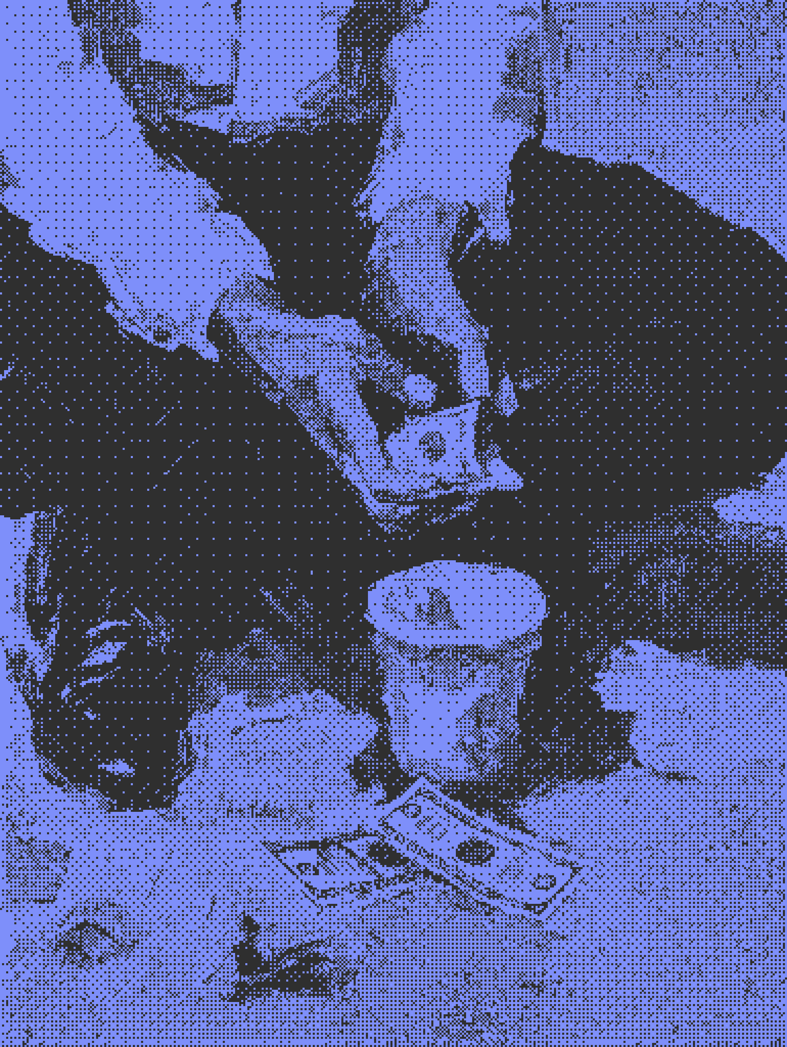
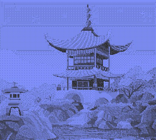
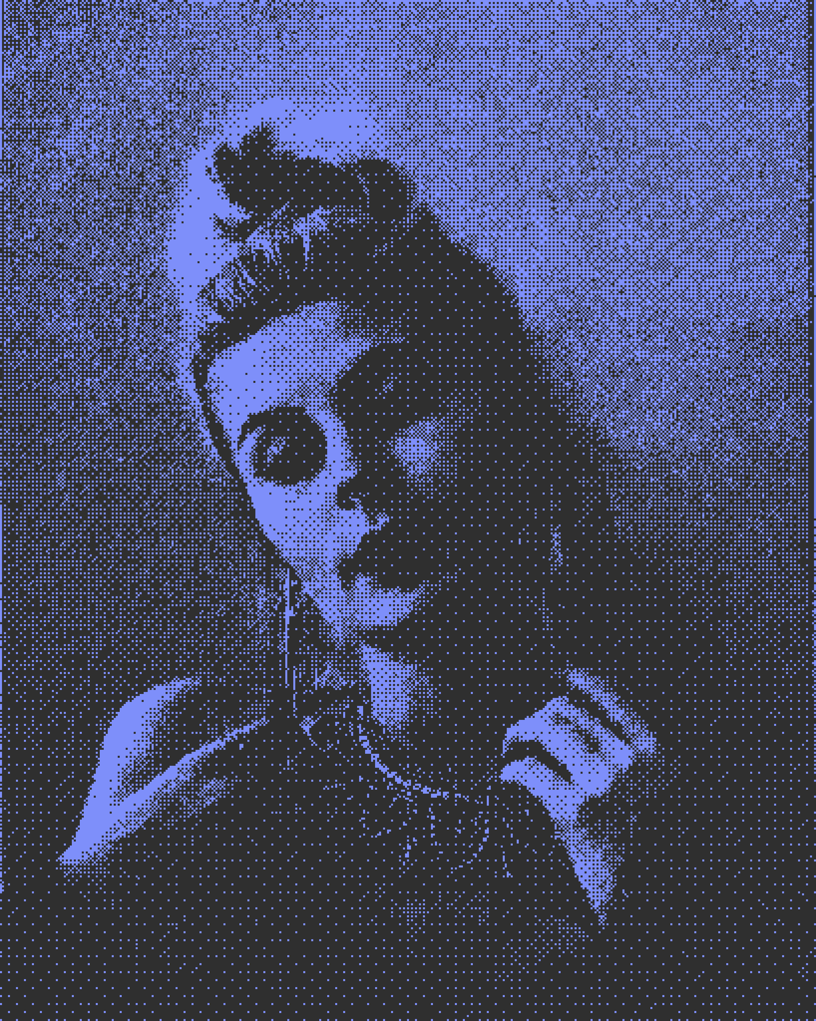
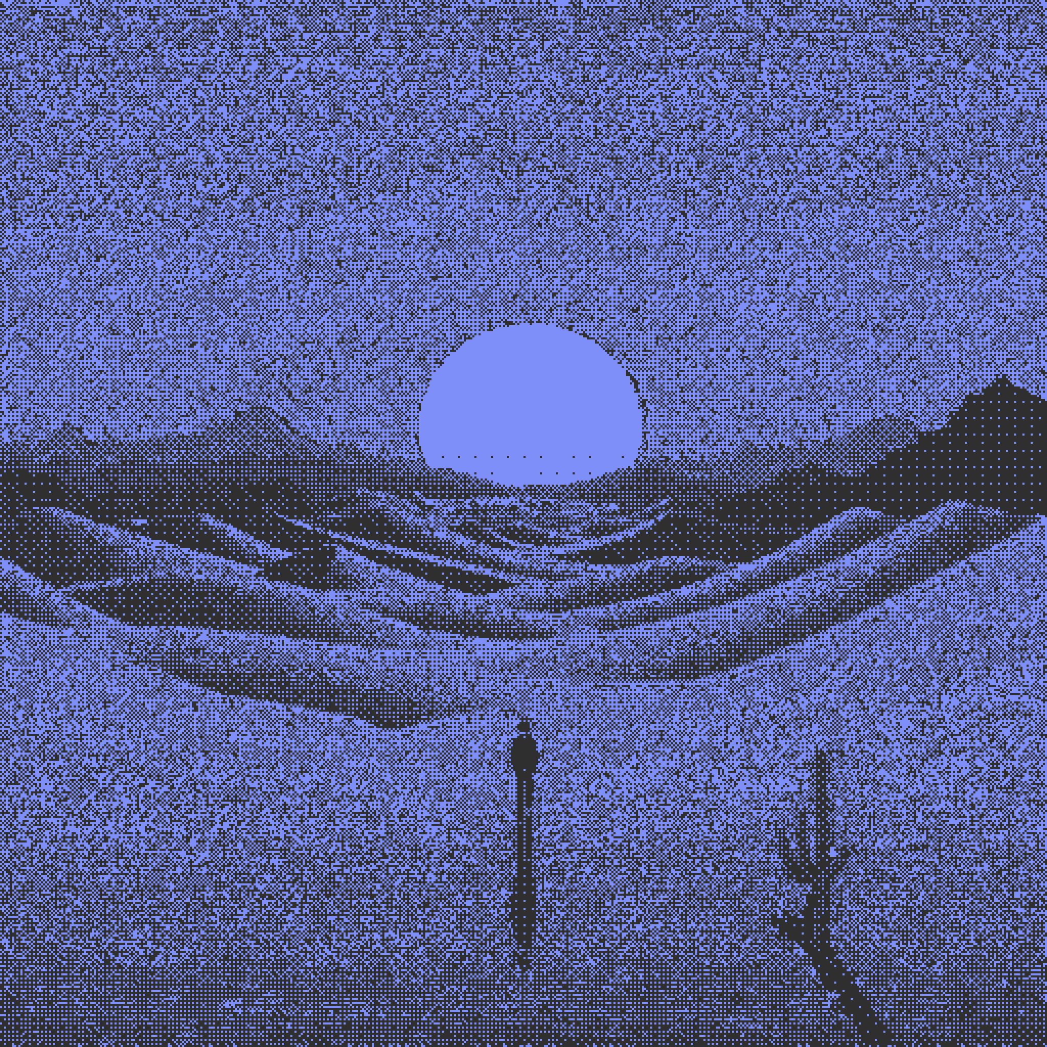
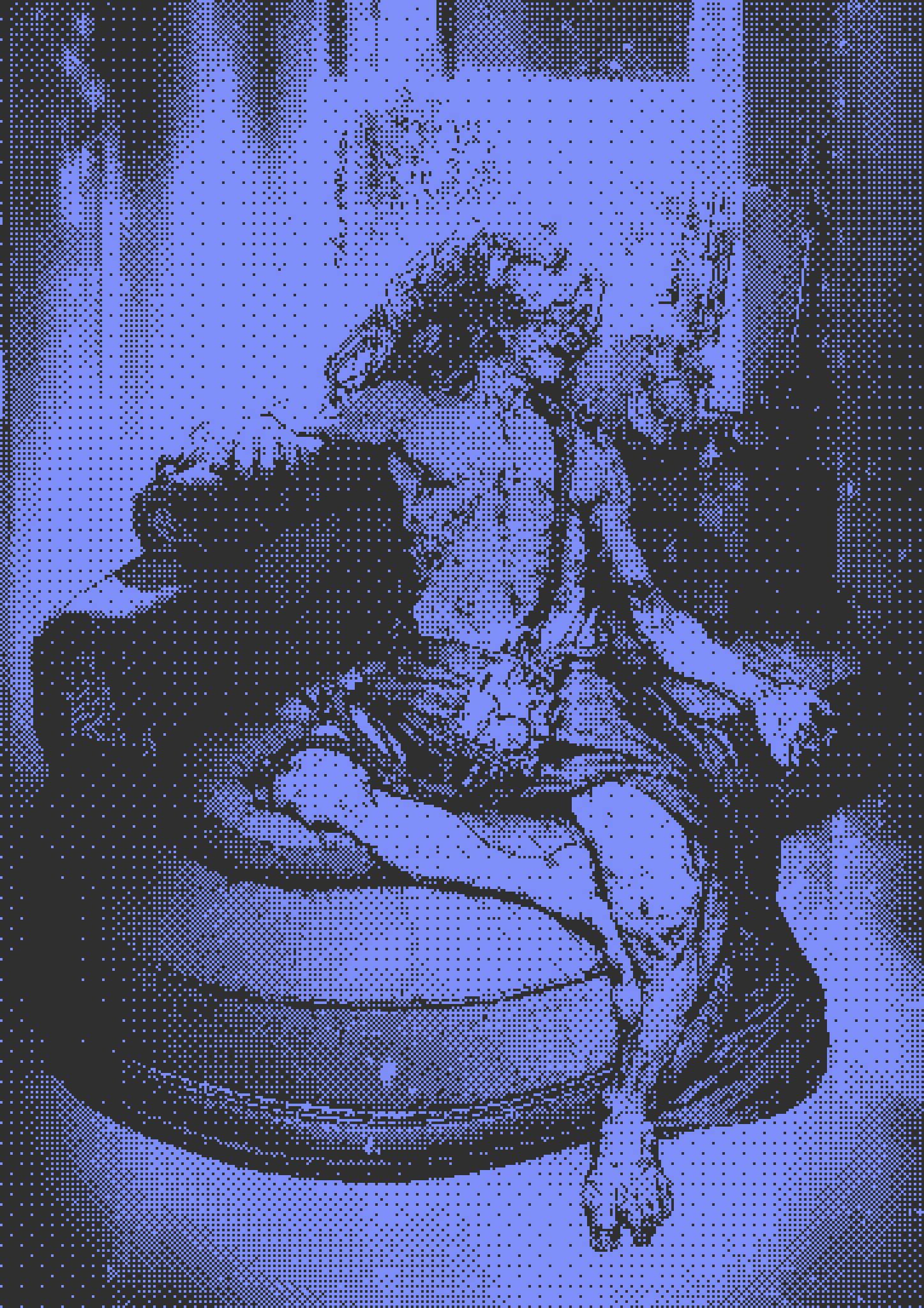
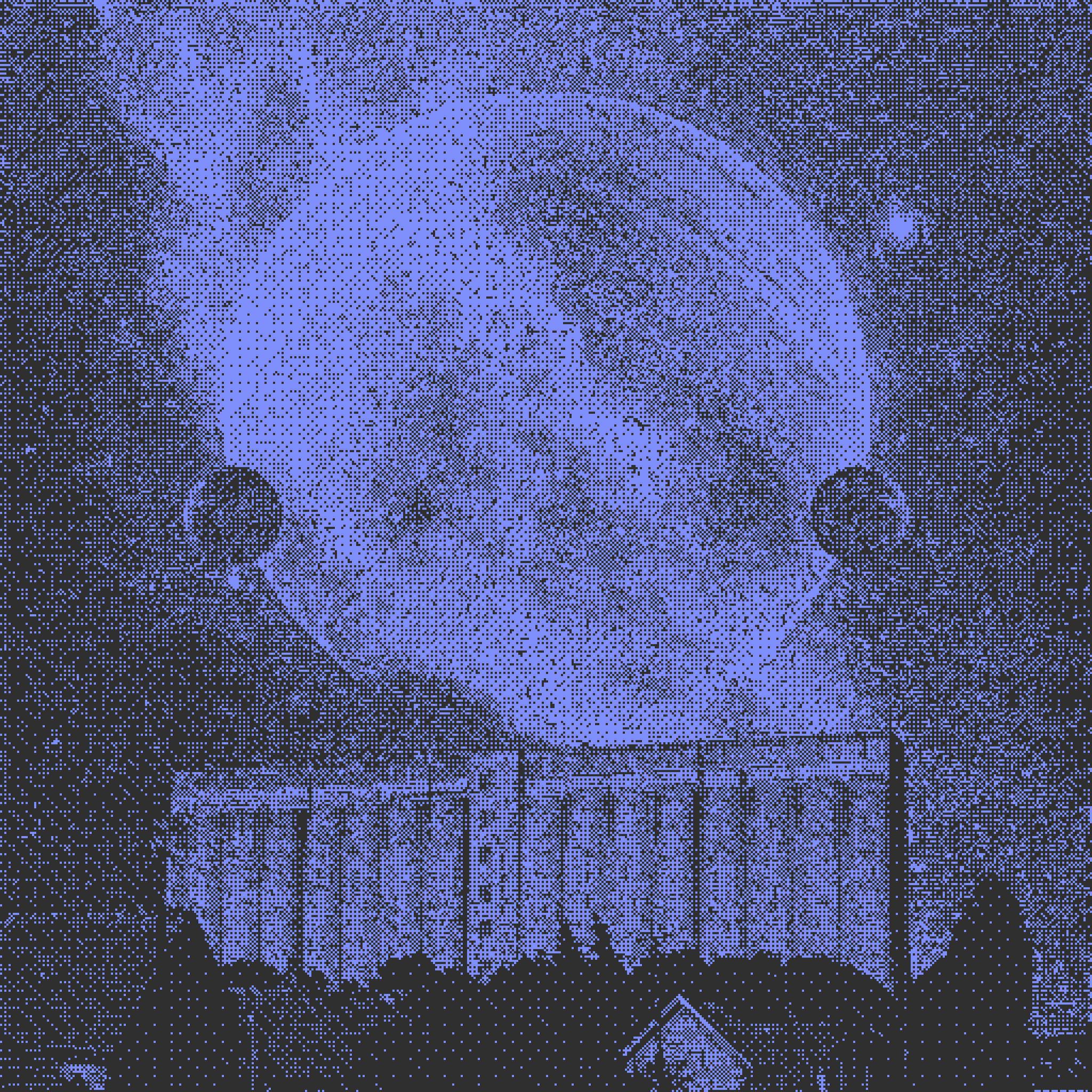
In January of 2023 I sent my friend Ely a message about a weird idea that I couldn’t get out of my head. What if you took the popular styles of precisionism and vector art and just… turned it into pixels? At the time, and even now, artists like Grant Yun and Terrell Jones had reached incredible popularity within our little artistic corner of the internet. So, I sent him this.

Ripcache? Robots?
This was a screenshot for the very beginning of a “diid” mood board. It actually never made it much further than this.
It might not have made sense at the time, but the idea was relatively straightforward. On top is a few pieces from Ripcache, crypto-famous monotone pixel artist with an affinity for CCTV cameras. On the bottom is one of my favorite pieces of modern art, “I Can’t Help Myself” which I won’t get too deep into. The question was simple: how do we turn this full color image into something that just contains 2? At the time, I didn’t know too much about dithering or the mathematics involved. I just got started doing it myself.
Going off of my comparisons to the color reduced vector art we’ve seen around the web, I started by putting an image through a step not often found in the dithering process: vectorization. I did it manually by first, just as I had intended to do with the subsequent painting of pixels. That being said, I was keen on optimizing as much of this process as possible, so I ran it through the set of Illustrator vectorizers as well.

Step 1: Vectorization
With some minor differences in composition, the manually vectorized piece managed to not only use a more reduced color set than many of the vectorized pieces, but also kept much smoother lines and curves. Edge detection and conversion from pixels to curves is hard for non-humans
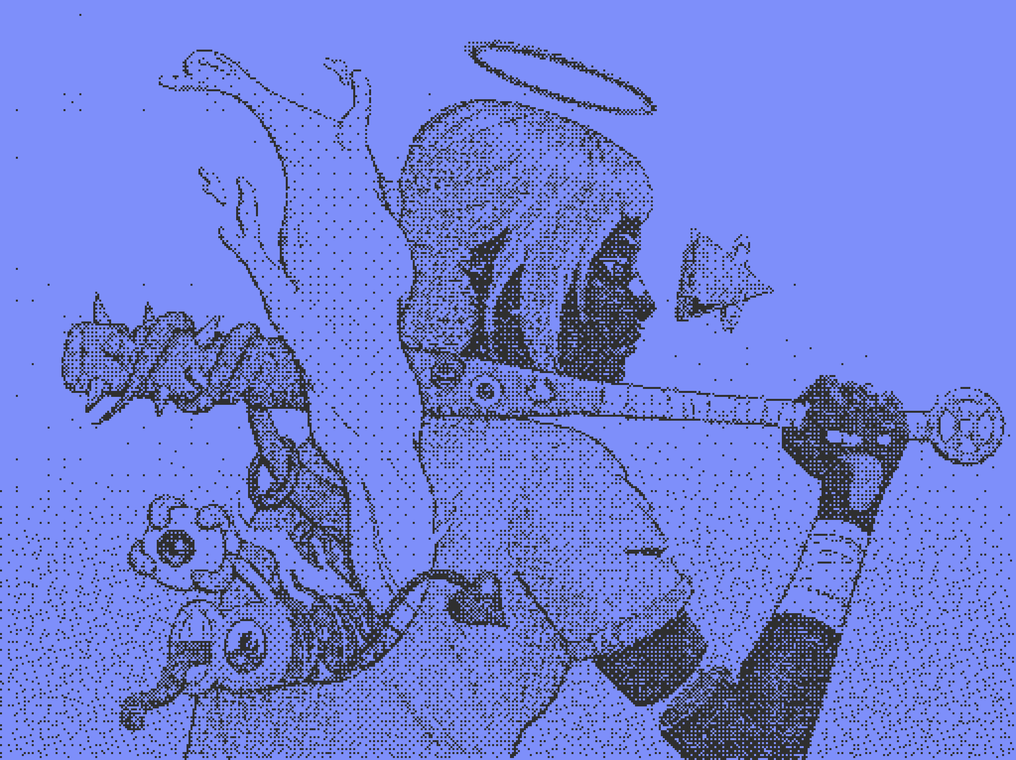
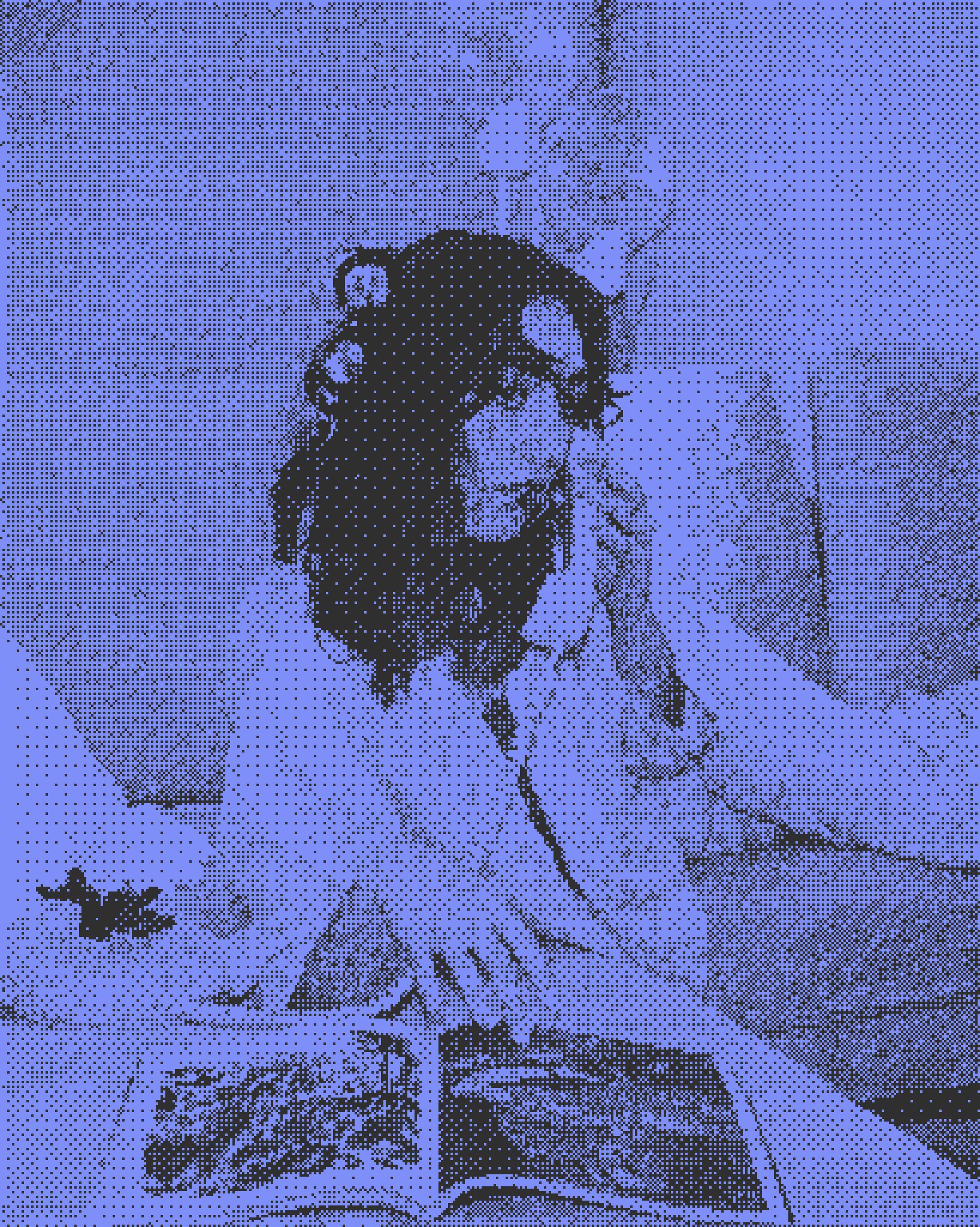
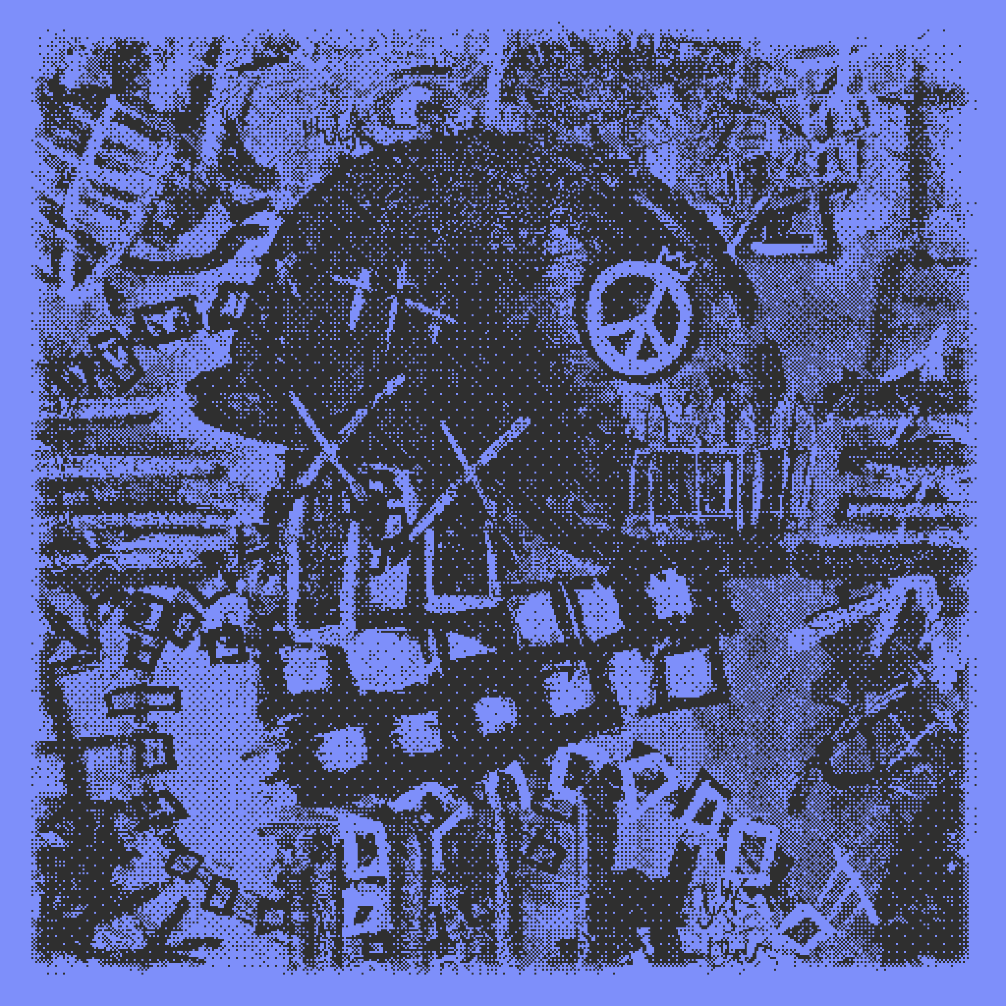
This provided some learnings, but mostly discouragement. For simple pieces like this, it was seemingly pretty necessary to vectorize by hand in some capacity. Maybe some cleanup could be done after the fact? Next up it was time to try out some pixels. Bound to create an interesting derivative of my favorite artwork at the time, Born 2 Die by Terrell Jones, I took a few modified versions of the art and threw it into Photoshop. Working with a 2 pixel wide pencil brush and lots and lots of clicking, I slowly worked my way across the composition.

Born 2 Click
Click after click, detail after detail, redscale to blue pixels we went.
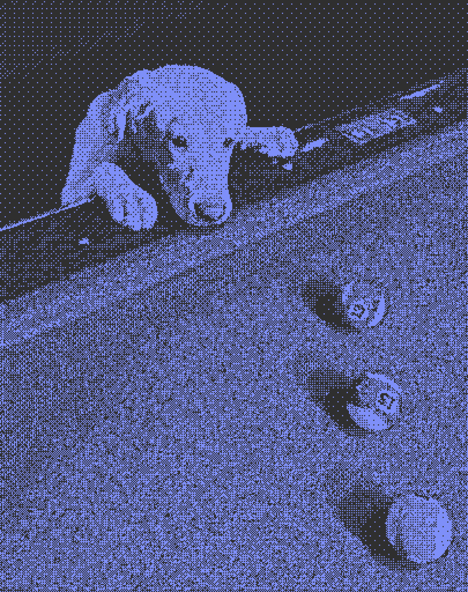
I made a friend in this process, one not often thought about when it comes to dithering or pixel art: Photoshop’s adjustment layers. This meant that, alongside the red pixelated source, I also had access to grayscale and color full resolution references.
The full set of references.
This full set of references taught me something more about this pixelation process: the importance of color in contrast.
While I didn’t exactly know what I was doing at this point, I was learning quite a lot. I would go on to learn more and more over the course of 9 more pixelated-from-reference works. During this process and hours and hours of clicking in Photoshop, nothing really changed. The important concepts generally stayed the same. Maybe that’s my adherence to routine, or maybe there’s something to be learned here from start to finish. From there, an idea for an algorithm was hatched.
First Principles & Halftoning
Long before there was the concept of photos or computers, we had the concept of printing art. As the simplest answer is generally the best, the majority of art printed was done with a single source in black ink on a light colored paper. Being far post renaissance however, we already had a good notion of shadows and how to make people look like… people. This is where halftoning enters the scene.
Consisting of a variety of strategies from crosshatching to Ben Day dots, this technology continued on even til today, where the concept of red, green, and blue color is often just a modified version of the low-color dot printing done throughout history.
Dithering had a slightly different goal in the color reduction, computational complexity. By reducing the number of colors you were putting on a screen, you could effectively do things much faster. If you were able to make those things look good, then you had a huge advantage from the start. On top of that, computers can’t really do things subjectively, so the best answer was the most mathematically ideal one.
So, for halftoning, the working principles looked something like this:
Reduce colors & make it look good.
For dithering, the equation changed:
Reduce colors & make it mathematically ideal.
You might notice the issue here, and it’s one I noticed early on experimenting with automated vectorization and dithering algorithms in general: mathematically ideal is not necessarily good. Computationally efficient algorithms work best on old-school computers and modern-retro video game shaders, but that doesn’t mean that they have to work on static artworks. So, an element of complacency is needed to move forward here. What would happen if we just… ignored computational efficiency?
Room for Improvement
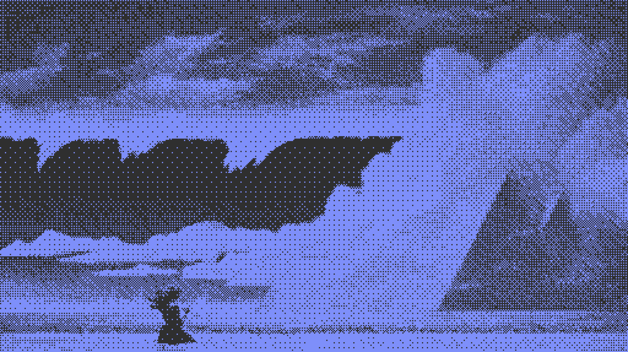
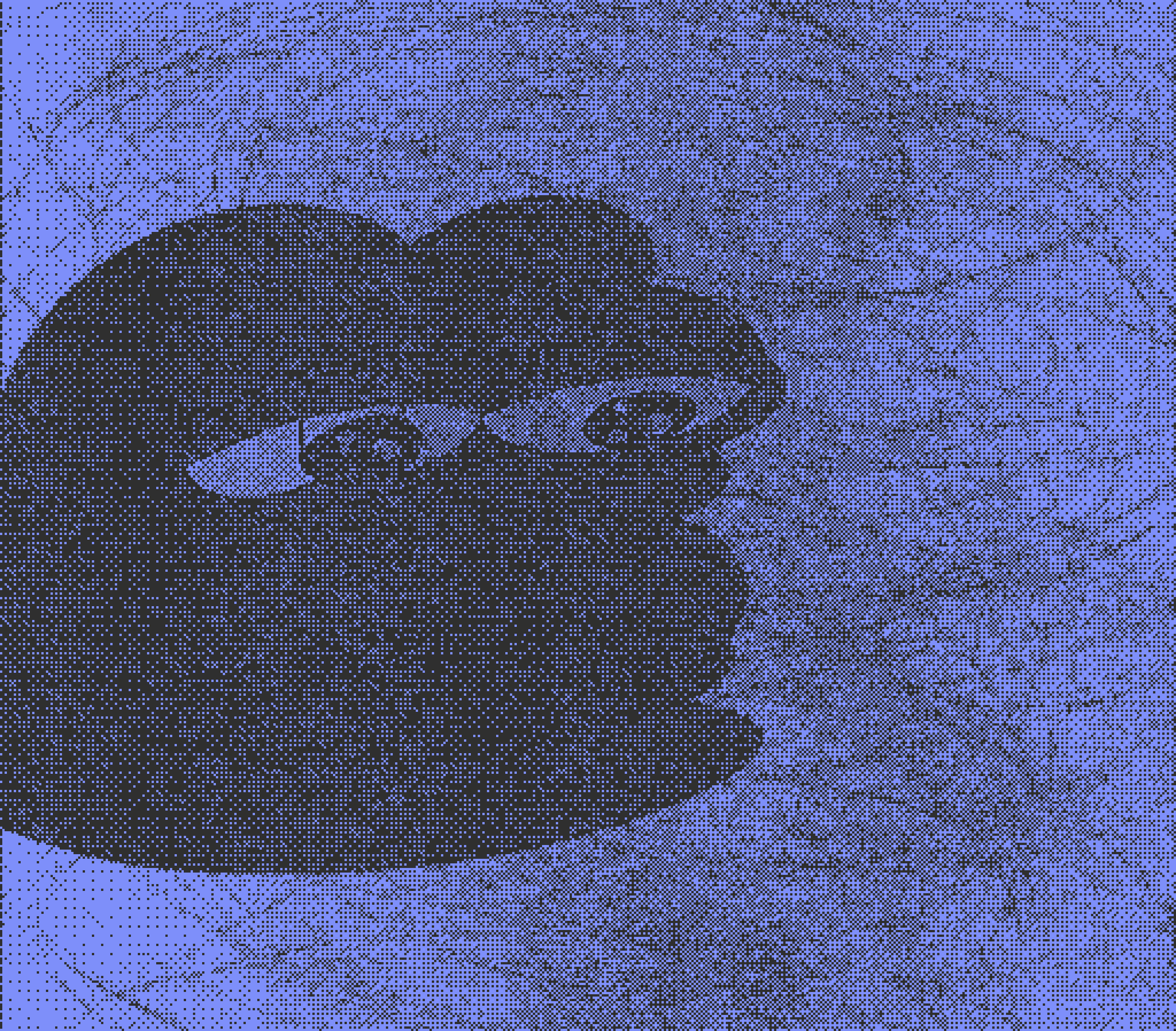
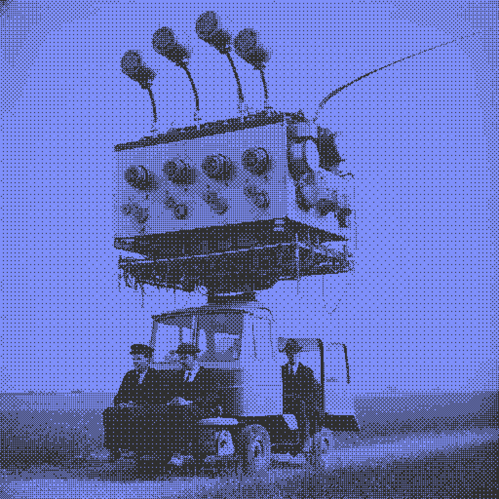
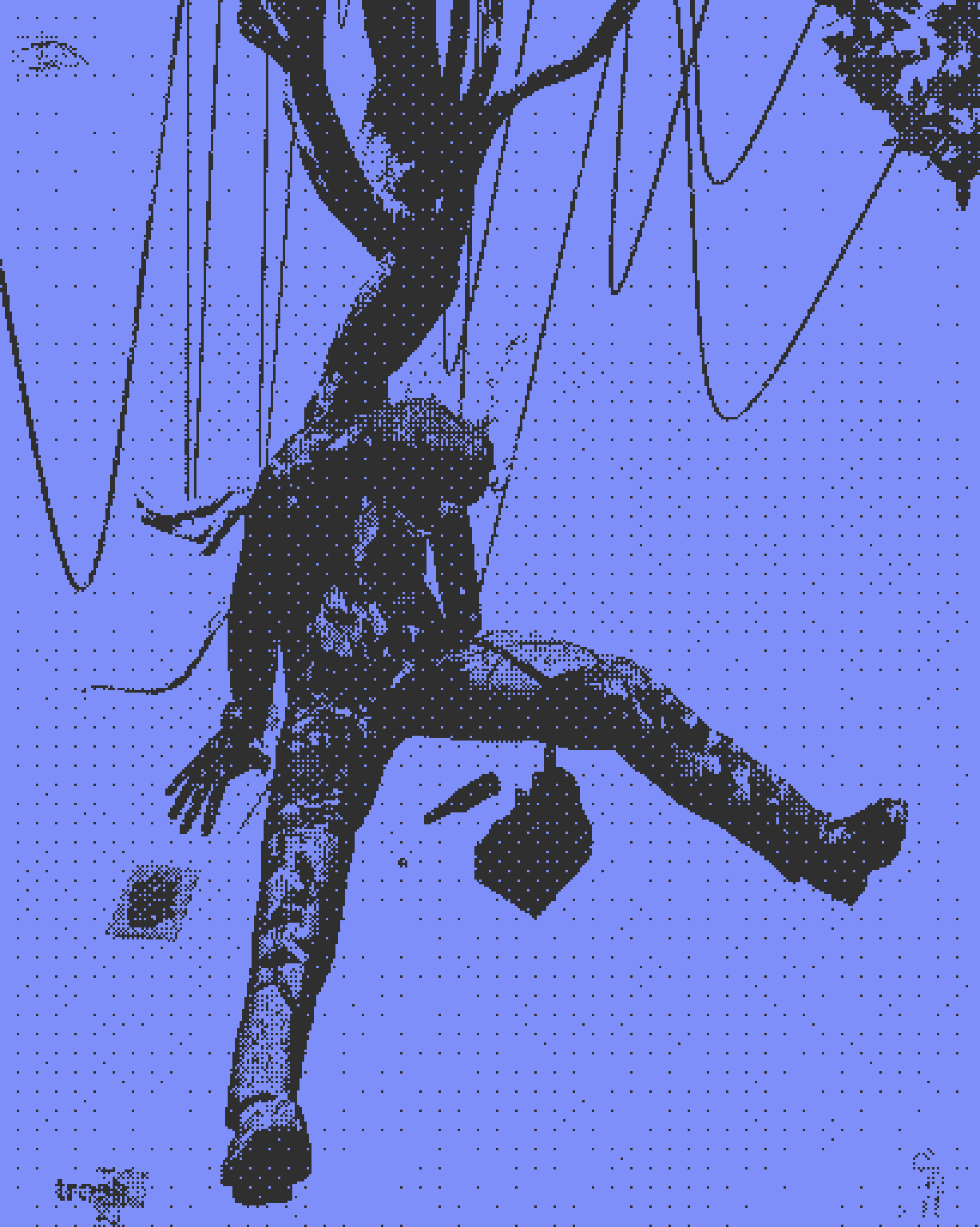
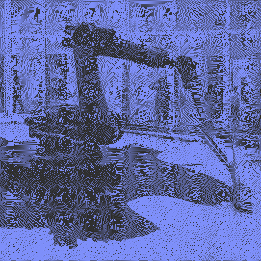
In order to identify where we can improve, we first need to set some standards. Staying true to my original goal, I’ll be using this image as basis for comparison

I Can’t Help Myself
Just a robot scoopin up some scary lookin liquids. What more is there to see?
The Old Guard
In order to identify where we can improve, we first need to try out the mainstay dithering algorithms and see what went wrong. For best comparison, these will be on default settings for brightness, contrast, etc. across the board, and put in my color scheme just to mix things up. We’ll look at the 3 most important classes of dithering algorithms - ordered, error diffusion, and reduced error diffusion - using the most popular from each.
Error Diffusion: Floyd-Steinberg
The first contender in the ring is Floyd-Steinberg. It’s a great option for most cases, which is why it’s likely the most used algorithm generally. It especially excels in full color, but obviously we don’t care much for that here.
Pros:
Doesn’t lose many details, is consistent in keeping things visually similar to the input image
Cons:
The main subjects of the piece seem to lose their importance. The pool of… water… is a dark and contrasted element in the source image, but seems to just be washed out here (for lack of a better term)

Ordered: Bayer 4x4
Another true classic on the scene, Bayer dithering gets a lot of things right here. I personally appreciate how the patterns seem to make the feeling of digitization more present and bring that to the forefront. If we’re looking for an artistic dither, this seems to be a good start.
Pros:
Gets at least some of the contrasting elements correct, and overall the contrast seems to be better.
Patterns are objectively cool. If you’re going to see the pixels, you might as well see something in the details.
Cons:
Details get washed out or are outright misrepresented. The patterns on the wall behind the machine seem to bear some sort of light reflection from the machine itself, and the hose at the top is washed entirely.

Reduced Error: Atkinson
Atkinson is, by quite a long shot, my favorite dithering algorithm for monotone purposes. It does a good job capturing the essence of the photo while also leaving the contrast in-tact.
Pros:
Gets the contrast AND a lot of the details correct, and doesn’t wash out the image.
Cons:
While this example worked well, it can get stuck on images with less overall contrast.
No patterns. We like the patterns.
So, reading through those, it’s time to rebuild our principles. Throwing computational efficiency and mathematical idealism out the window, what will give us the dithered result that is the nicest to look at? Something built not for general purpose, but for artistic purpose.
Principles of the Untitled dither:
Patterns, for visual interest with visible pixels
Contrast, for the best representation of subject vs. background
Details, for the most accurate representation of the image at hand
So that is where we start, with the easiest thing coming first.
Pattern Dithering
A mathematically abhorrent cousin of the ordered dither
The principles behind ordered dithering are relatively straightforward. If you were to take the naive solution to turning an image black and white mathematically, you might just set a single comparison. If a given pixel is brighter, it goes white. Dimmer, and it goes black.
Ordered dithering is a simple but efficient variation on this, it simply changes that comparison for every pixel in a set order defined by the “matrix.” So, your first pixel might need to be purely white to turn white, but the second one only a dull gray. Simplicity goes a long way here.
The important thing to note is that both basic thresholding and ordered dithering are efficient in using the information provided to them. Each individual pixel has a purpose, repeated over and over and over. With ordered dithering, the combination of comparisons in the matrix is spread evenly across the entire matrix in order to provide the most information possible. This is the mathematically ideal way, no wasted space.
If you’ll remember, my principles did not contain mathematical idealism. Instead, that was replaced for “looks cool”, and the majority of patterns within an ordered dither simply do not look cool. For that reason, we’ll be clustering together certain parts of the ordered dither matrix in order to provide consistently cool patterns. We’re throwing away an objective ideal for a subjective cool. The results can be felt immediately on this dither of a simple gradient, with the Bayer matrix shown on the left and the Untitled patterned matrix on the right.
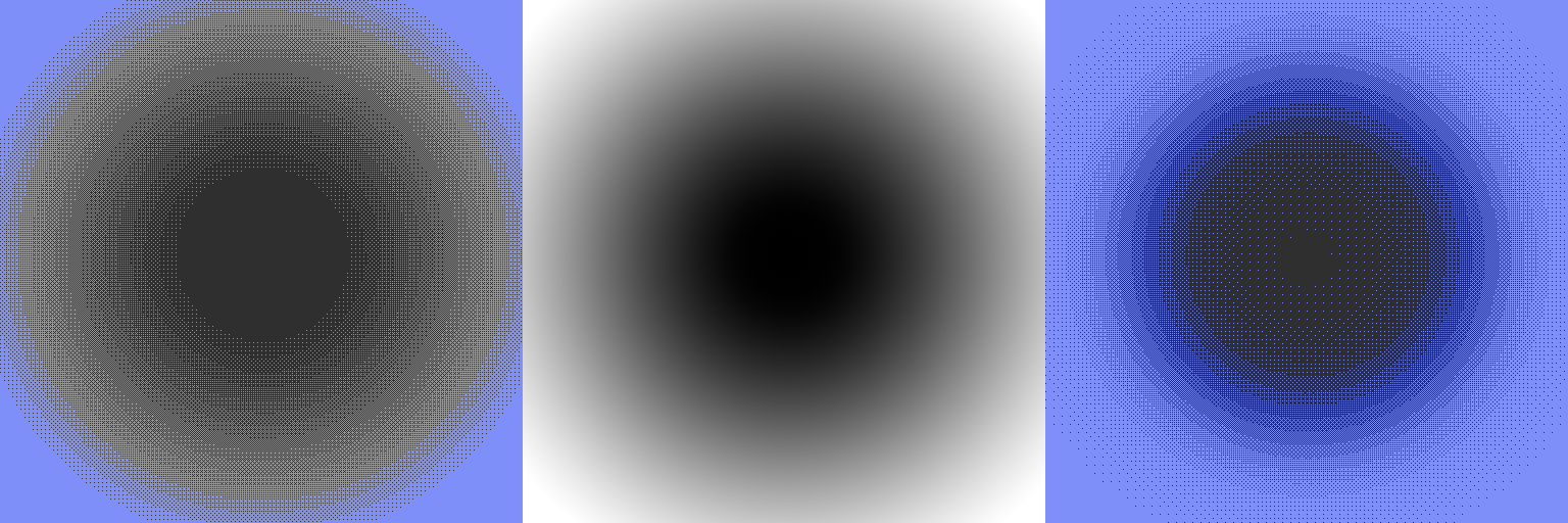
While the image on the left is more true to source, the image on the right is immediately entrancing. The usage of the patterns makes you feel each individual pixel rather than just making an attempt at staying true to source. It’s artistically… cool! So, a patterned dither it is. To keep track, here’s our reference photo with the pattern applied:

A patterned attempt
Subjectively cool, mathematically atrocious, all around pretty nice to look at.
Light & Contrast
Now that we have our patterns knocked out, it’s time to talk about contrast. Contrast in dithering is really hard, because when you’re looking at a random image it’s hard to tell how the light is distributed. In an ideal world, the light would be evenly distributed with the background and foreground visuals having the highest separation. In reality, that’s not the case.
So when we talk contrast, rather than looking at a distribution of exposure, we have to talk about what we actually want - visual differentiation between major elements. One of my favorite points of contrast in our reference image is the pool of liquid vs. the mostly white floor. It’s important that those things stand out, and most of the dithers (Atkinson withheld) have trouble with that. So when we’re talking about contrast, we’re really talking about detecting the edges of different elements and spreading them out as far as possible.
Edge Detection
Edge detection in image processing is a relatively well known concept and used broadly in a lot of cases. In some form, most automatic filters are doing edge detection. What intrigued me most were multi-exposure edge detection algorithms. If you have an iPhone, you might know a good example of this as “portrait mode” where the main subject is cut out and the background blurred. For the rest of us, this comes in the form of HDR or “High Dynamic Range” photography.
Back when cameras on phones weren’t great (oh a whole, what, 5-10 years ago?), we started seeing the advent of software-assisted photography. The most direct example was HDR, and particularly a concept called “exposure fusion” coined by Tom Martens, Jan Kautz, and Frank Von Reeth. This strategy took a number of photographs taken with different exposure settings at near-identical times and combined them into one “gold standard.”
In order to do this, they scored each individual pixel on 3 criteria:
Well exposedness - how close logarithmically the pixel was to being 50% exposed on a normal (Gaussian) curve.
Contrast - our good friend edge detection, apply a Laplacian transform and find where the most contrast (and therefore the most important details) is.
Saturation - longer exposures flatten colors, so to get the brightest version of each they wanted to check saturation as well.
In their case, each of the criteria was done on each of the 3 channels of color - red, green, and blue. While individually they are pretty common strategies, together they give spectacular results.
So how can we use this?
Well-exposedness
While it might feel like we want to keep things generally spread apart in order to retain contrast, we also have access to a lot more detail in the center of the exposure spectrum. After all, the patterns are part of the fun here, so why try and tend things towards true black or true white? For this reason, we’re simply utilizing the exact same strategy used in exposure fusion: applying a normal distribution to our photo and using that in our “score.” I could write the math, but I prefer to work in code, which in Javascript looks like this:
Math.exp(-Math.pow((val - med) / 256, 2) / (2 * Math.pow(sddev, 2)))After lots of experimentation, I too found that their median (0.5, or 128 in 8 bit terms) and standard deviation (0.2) worked best for this purpose as well.
Contrast
It’s time to creatively borrow yet again! This time, I’ll offer some modifications however. We too want to apply a Laplacian transformation on top of our matrix, but we want to make sure that it both reaches far enough to incorporate the boundaries between the patterns (otherwise it’ll just be comparing patterns to each other) and that it weights the current pixel more heavily. This is a bit of noise reduction on our end, the results of hard edge detection can be strange at times. In their paper, they explicitly toss away any noise reduction and explain that any edge is a good edge. While this works great on high-detail images where the exposures are relatively similar, we’re being much more aggressive here. As such, the modified Laplacian kernel looks like this:
const LoGKernel = [
[0,  1,  1,  2,  2,  2,  1,  1,  0],
[1,  2,  4,  5,  5,  5,  4,  2,  1],
[1,  4,  5,  3,  0,  3,  5,  4, 1],
[2,  5,  3, -12, -24, -12,  3,  5,  2],
[2,  5,  0, -24, -10, -24,  0,  5,  2],
[2,  5,  3, -12, -24, -12,  3,  5,  2],
[1,  4,  5,  3,  0,  3,  5,  4,  1],
[1,  2,  4,  5,  5,  5,  4,  2,  1],
 [0,  1,  1,  2,  2,  2,  1,  1,  0]];
You’ll notice that in the center, as numbers get smaller and smaller, there’s a quick jump up from -24 to -10. This is the adjustment that was made to the kernel. Once convolved with the matrix, we get the second piece of our “score.”
Saturation
As you would expect, saturation doesn’t play a whole lot here. We’re comparing the outputs of the dither in this scoring, so saturation is equivalent to the exposedness in this instance. We will, however, continue to use color in a way you might not expect though!
What are we scoring, anyway?
You might be reading this and thinking “this is really cool, there’s math involved!” You might also be reading this and thinking “we only have one image.” You’re correct either way!
Exposure fusion works best if you’re taking 3 distinct images from the camera at the same instant. We only have access to 1. So, we need to cheat the system, with a little poor man’s exposure adjustment. That simply looks like this:
let px = imgPixels[i] + imgPixels[i] * exposure;
if (px < 0) px = 0;
 if (px > 255) px = 255;
For our adjustments, we’ll use pairs of positive and negative decimals to help adjust our exposures. You can use as few as 1 (0 for “exposure” here) or as many as 5. The pairs are as follows: 0, 0.1, -0.1, -0.05, 0.05, 0.15, -0.15, 0.03, -0.03
Again, these are what I found to be nice adjustments, but there’s nothing stopping you from changing these and seeing what happens.
With this and our scoring formula, we can produce multiple grayscale exposures of a single image, dither them, and then combine the most useful pixels into something that has good contrast. So, patterns and contrast down, what’s next?
Color in the Details
While exposure fusion does fine on its own on a grayscale image, one of the things that always bothered me about monotone dithering algorithms is the insistence on one-dimensionality. They only ever look at the gray pixels. There’s a reason folks don’t just shoot black and white anymore, it can be difficult to capture the full story without the full breadth of colors available to you.
That’s why this algorithm adds a little spice. In addition to scoring and fusing our reference grayscale exposures, we’ll also color adjust exposures to make sure that we’re capturing edges and contrast between colors. That’s done through a perception adjusted luminance:
  // 0.299*r + 0.587*g + 0.114*b = brightness
  const diffs = [0.299, 0.587, 0.114];
That is then adjusted further by a passed-in adjustment value:
  for (let di = 0; di < 3; di++) {
    if (di === c) diffs[di] *= mainDiff;
    else diffs[di] *= diff;
  }
From there, everything is handled just about the same as our grayscale exposures, and fused using the same metrics.
Drumroll, please.
But first, a note from our sponsors.
It’s important to quickly reiterate here, this alogrithm is built for complexity. I follow the software engineering axiom “make it work, make it fast, make it good” to a t. This algorithm works. It is not fast. It is not good. It simply works. It takes a long time to run, and has a high complexity. It could be parallelized or GPU accelerated but yet here we are all the same. This was a proof of concept, and it’s time to prove the concept.
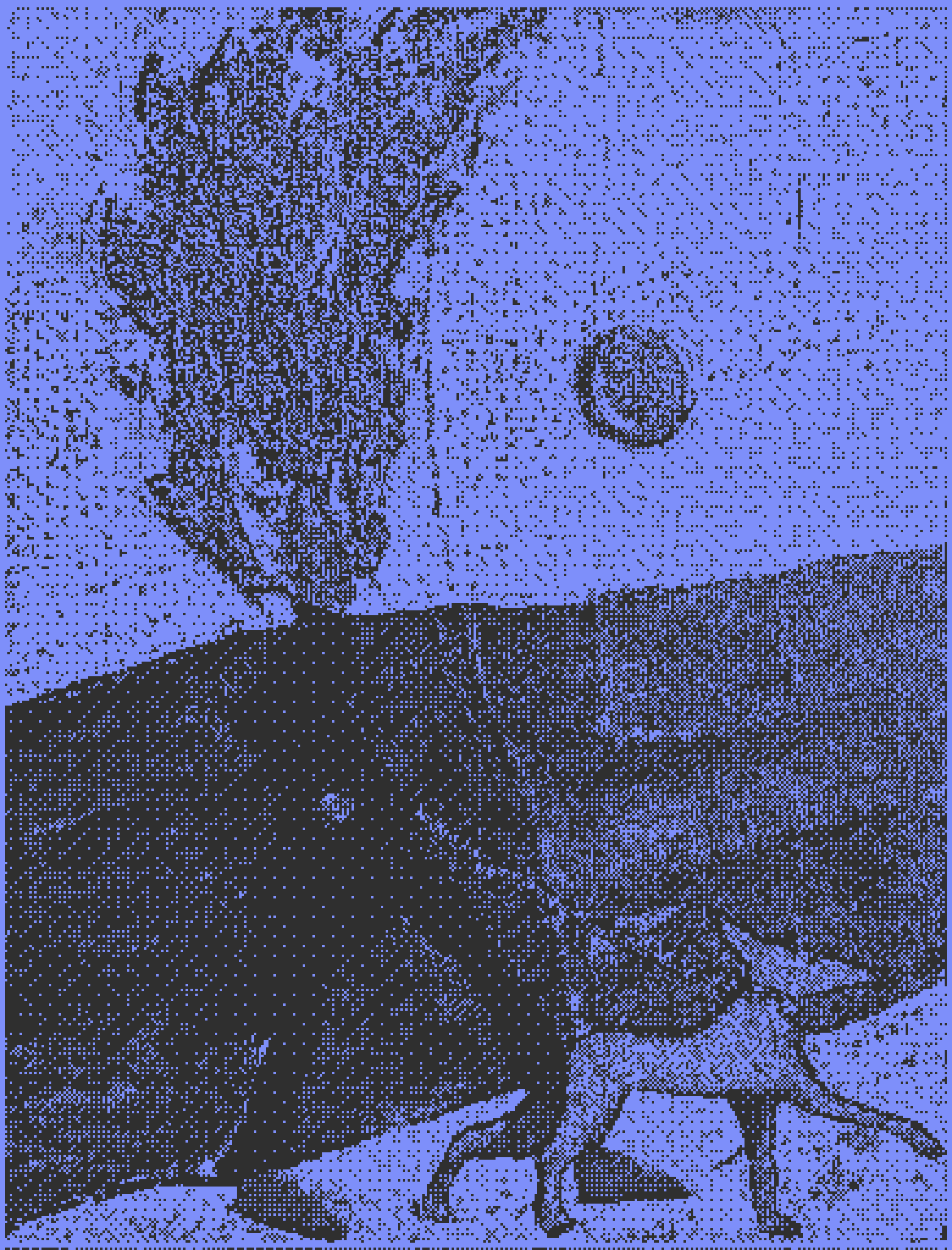
The results

I’ll let you take in the sights of the dithered glory, but in the meantime lets talk about where this all excels, and where there are potential points for progress in the future.
First, I don’t love how sparse true white and true black are here. I’m sure that’s just a symptom of adjusting exposure algorithmically and then filtering out the edge cases there, but I would really like to see the whole breadth of the color (or, pattern) space used here. The tool you can use yourself does have a “normalization” option that was my first attempt at this, but it didn’t feel right. If we’re really leaning into a complacent approach here, a Kmeans style algorithm for normalizing exposures would be perfectly suited for this purpose, but would add exponentially to the calculation time. We need acceleration there before I’d even try, I’m not crashing js-based browsers with that.
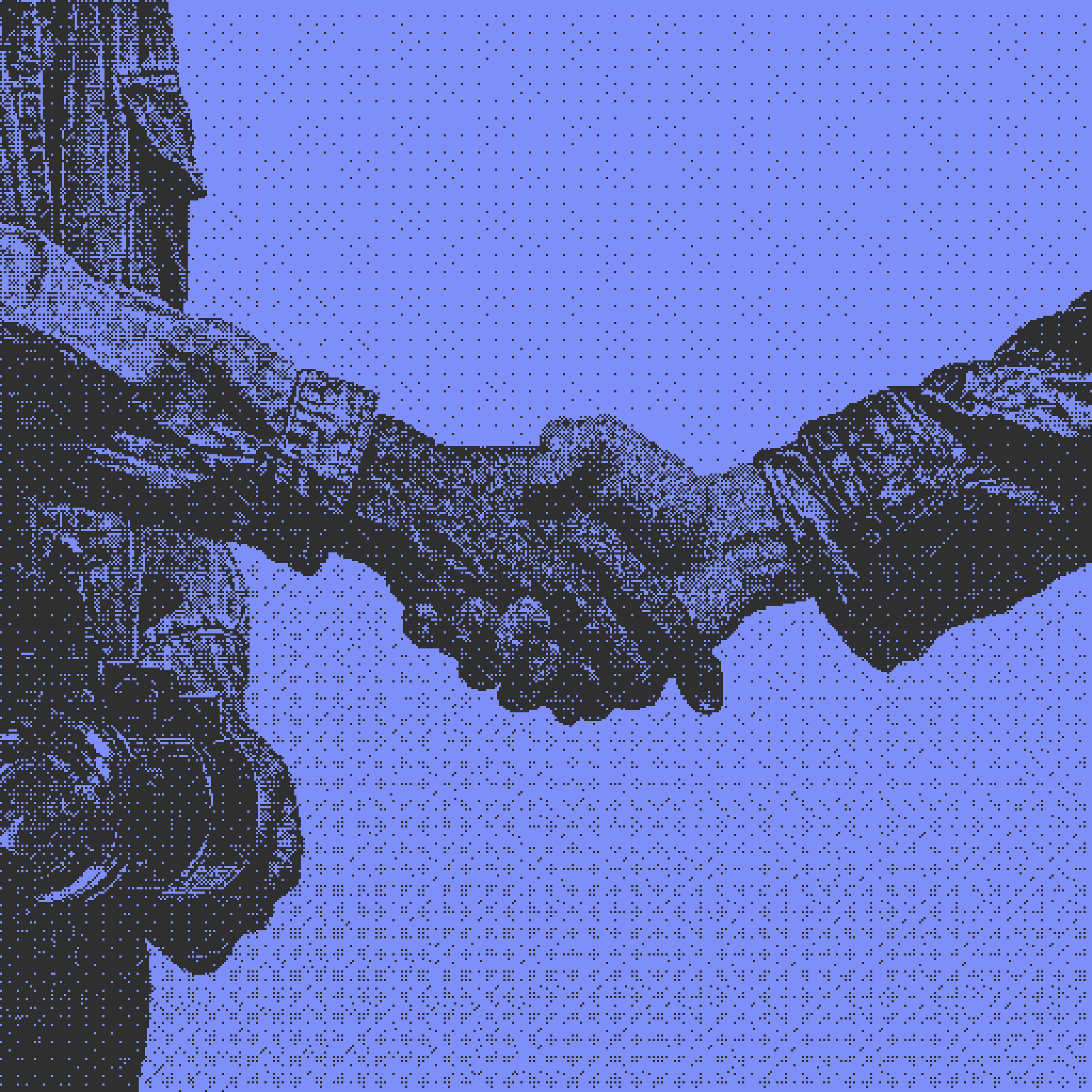
That being said, a lot of the principles are hit right on the head here. The subjects have great contrast, just look at how much picture-taking patron in the background pops compared to the other algorithmic options. The bubbles are in the water. The hoses on the machine keep the luster. Every dial and detail seems to hit just right, while the patterning keeps just enough of its flair to really pull you in.
Artistically, I’m in love with this output, and I’m really proud of this algorithm. If you feel the same sense of excitement, it’s time for you to get involved.
Titling Untitled
Closing a chapter.
While writing a dithering algorithm has always been part of the plans here, there’s another plan that it is fulfilling: the end of a collection. Since starting this pixelated art journey, I’ve hand-dithered 9 total 1/1 artworks to be stored fully on the Ethereum blockchain. This genesis collection, Orsus, represents a large percentage of what I consider to be my greatest work, spreading between collaborations and solo efforts, modern styles and historic ones, and making statements about creative technology, accessibility, and web3 culture. There’s one last technological leap I need to make to call it an end though: me.
So, Orsus #10 will break the rules of the previous pieces in the collection by being algorithmically dithered with the algorithm we just built together. Built simply to replace myself in this process. “Uncertainty” will drive home the final piece of the Orsus puzzle: creative technology is art, and without creative technology we would not have art.

This piece will be stored fully on-chain, alongside this initial implementation of my dithering algorithm, to live forever within the Ethereum virtual machine. While I was originally planning on giving naming rights to the first owner of the artwork above, it failed to hit reserve within a few weeks, and therefore naming went back to me!
This algorithm is now known as Teddy-Beau, after my kids. You can buy naming rights for the cost of 8 years of college tuition, if you’d like!
All in all, I’m very proud of how far I’ve come as an artist, ditherer, and crafter of pixels. I believe this piece is a good final stamp on the beginning of my artistic journey, and am glad you all have come down this path alongside me.
In catena ab initio, in catena in aeternum.
Addendum: DIY
Teddy-Beau is available free for all to use, and CC0 licensed, here. If this post wasn’t clear enough: it is not fast or optimized, and will crash at times. It is recommended to keep both sliders relatively low. If you wish to dig into the code and do something with it for yourself, it’s found in plaintext here.
Addendum: Examples
Thanks to my friends on Twitter/X, I’ve been able to dither a bunch of artworks using this process and share them in this gallery here. These have been dithered largely with default settings.